Minute

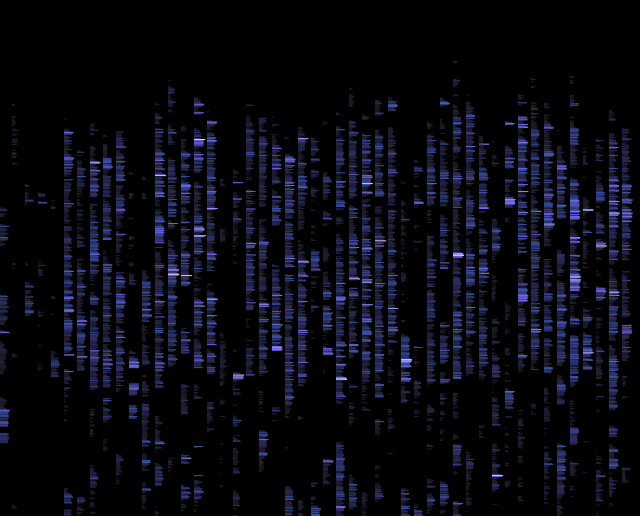
Minute counts keystrokes and every two minutes records how many keystrokes have transpired in a CSV file.
Minute-reader uses d3 to build a visualization in the style of gel electrophoresis. It loads minute’s data directly using d3’s CSV reader - the data is compact, so months of data should still be usable.
It’s a subset of functionality that I found to be really compelling in workrave and RescueTime - it doesn’t do anything with the internet, like RescueTime, or tell you to change your ways like WorkRave and other RSI-related applications.
It’s easier for me to track my usage of technology accurately than it is to track non-usage, so I’ll treat leisure and sleep time as the inverse and make no attempt to do some kind of Arduino hack to track hours of sleep.

The code is open-source and adaptable, but the Objective-C is shoddy and would love improvement. For what it’s worth, Apple makes keylogger-writing easy with a very direct API:
[NSEvent
     addGlobalMonitorForEventsMatchingMask:NSKeyDownMask
     handler:^ (NSEvent *event) {
~⇾ tail ~/log/keystrokes.log
1323966900, 206
1323967020, 76
1323967140, 27Minute doesn’t log which keys - only their frequency. An evil version, ‘thisisakeylogger’, does track keys but isn’t open source. It’s what I used to generate graphs of key transitions.


Incidence statistics make my vim usage apparent: jj, kk, ww, and bb are all ‘gestures’ in the editor.
The above charts (besides minute’s own output) are generated using really simple bits of code with node-canvas as my preferred drawing toolkit. It’s simple and near-perfect - the Canvas specification doesn’t jive with bitmap fonts, so I might need to write some custom code to make Silkscreen usable.
I’ve been really interested in the style of my friend Emily Fuhrman and the various projects going around based on libcinder. The other big design style is d3’s - white background, Helvetica’ed, ColorBrewer’ed information. Somewhere between the two seems about right - there’s a certain beauty to infographics that are made to be puzzling for a few seconds before the understanding strikes.
Tracking nearly anything you do is alarming and humbling. The aggregates of our actions are lost on us: we can watch hundreds of hours of television and write it off as a small time commitment. How much is too much? It’s hard to make pretty charts without learning something and thinking about what they should look like.
See Also
- The Personal Analytics of My Life by Steven Wolfram went public a month after this post and has much more longitudinal data.
- Marcin Ignac’s Every Day of My Life is also super-similar, and uses probably similar code written by deanm to track keystrokes and a custom plask script to visualize it.
